Bookshelf
The core of Izzi Digital. A digital library that had to stay simple for teachers while managing real complexity underneath.
01 CONTEXT
The product everything else hangs off
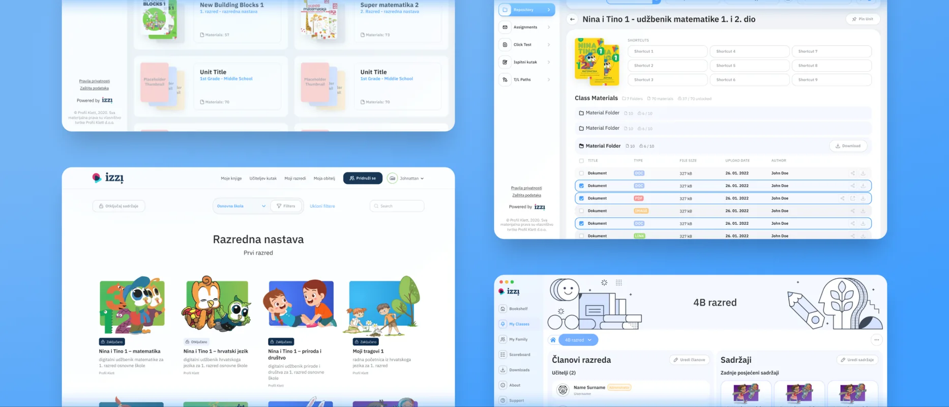
Bookshelf was the first product we worked on at Izzi, and the centre of the whole suite. On the surface it is a vertically scrolling library of learning materials: PDF books, interactive books, and games. It is also the home base, with every tool Izzi offers one click away in the main navigation.
The brief was deceptively plain. Keep the front door simple enough for a teacher or a child to use without thinking, while the structures behind it carried far more weight than the interface let on.
02 PROBLEM
One product, three jobs
Bookshelf is three things at once: a simple library for a child, a deep management tool for a teacher, and the hub connecting every other feature in the suite. Each wants a different interface, and they had to coexist without any one ruining the others. Three tensions ran underneath every screen.
Effortless for a child
The front door has to be effortless. A student should open the shelf, see their materials, and start reading or playing without instruction. That simplicity means complexity kept out of sight, somewhere a child never has to look.
Deep enough for a teacher
Teachers need real control: organising materials by subject, nesting them into units and folders, linking them to publications, deciding what is published or locked. That depth is the opposite of the child's simple shelf, and it had to sit on the same product without bleeding into the reading experience.
The hub of the suite
Bookshelf is also the connective tissue. From it a user reaches Teacher's Corner, the Flipbook reader, the games, and the native apps. It had to be a believable home base for all of them while still working as a product in its own right.
03 WORK
The shelf and everything behind it
The work spanned the library itself, the management tools built on top of it, the games it launches, and the native apps that carry it offline. Five areas carried most of the work.
01 THE LIBRARY
The shelf itself
The core of Bookshelf is a vertically scrolling library of learning materials. It is the landing point and the direct route into the content, simple by design because it is the first thing a teacher or a child sees. The job was keeping browsing effortless, so the shelf earned its place as home base rather than just a list.
02 TEACHER'S CORNER
Teacher's Corner, built from scratch
The feature we spent the most time on, designed new rather than inherited. Teacher's Corner gives teachers a place to organise everything they need for class, structured by subject, with units, nested folders, and materials underneath, each with publish, lock, and permission states. Teachers and students see a clean reading view. Superadmins see a full management surface. The same screens, doing two very different jobs.
03 CREATING AND MANAGING
The machinery behind it
Behind Teacher's Corner is the machinery that fills it. Multi-step flows for adding units and materials handle titles, thumbnails, publication relations, keywords, grade and subject assignment, and nesting, with units and folders creatable inline so an admin never breaks their flow. Edit and delete flows mirror them, with reorder, rename, and bulk selection on top.
04 SHELL APPS
The game player
Bookshelf launches dozens of interactive e-learning games through a dedicated player. We polished the game slider that streams challenges, controls, and progress in one consistent frame across both Bookshelf and Playground, and designed a number of the games themselves.
05 NATIVE APPS
Native on mobile and desktop
Beyond the browser, Bookshelf ships as dedicated mobile and desktop applications. The same library and materials, adapted to each platform's conventions so the experience holds up on a laptop in class or a phone at home.
04 DECISIONS
Where the complexity should live
The everyday decisions were routine. These two set how the simple-surface, complex-underneath balance actually landed.
CALL 01
Collapse folders by default
A populated unit can hold dozens of materials across several folders. Showing it all flat would be honest to the data and exhausting to use. Collapsing it hides content a teacher might be looking for. Neither default was obviously right.
WHAT WE CHOSE
Folders collapse by default and act as a clutter-reducing layer. A teacher opens only the folder they need, and counters on each folder show what is inside before opening anything.
TRADE-OFF
A teacher hunting across folders does more clicking than a flat list would need. Worth it, because the flat version made even a small unit feel overwhelming, and most teachers return to the same few folders anyway.
CALL 02
Spell out every delete
Deleting a folder collection can ungroup folders. Deleting a unit can wipe out scores of nested materials. The light version is a simple confirm dialog. The heavier version lists everything that goes with it.
WHAT WE CHOSE
Spell it out. Delete dialogs surface the exact count of affected folders and materials, with the items listed. For an admin managing content other people depend on, the extra friction is the point. A wrong click should be hard.
TRADE-OFF
Heavier dialogs and an extra beat of reading before every serious delete. Acceptable, because the cost of a silent mistake on shared classroom content is far higher than the cost of one more glance.
05 OUTCOME
What shipped
Bookshelf shipped as the working hub of Izzi Digital across web, mobile, and desktop. A simple scrolling library on the surface, with Teacher's Corner built from scratch on top, a full set of management flows behind that, a game player running dozens of interactive lessons, and native apps carrying it beyond the browser. The child's view stayed simple while teachers got real depth.
One lesson carried forward: the Flipbook reader is the piece we would not leave behind again. It kept its dated interface throughout, always lower priority than the next structural problem. The redesign that proved what it could be happened later, on Playground.
- 3
- platformsWeb, mobile, and desktop, with dedicated native apps alongside the browser.
- 1
- tool built from scratchTeacher's Corner, designed new rather than inherited, structure and forms included.
- 3
- audiences, one productA child's library, a teacher's management tool, and a hub for the whole suite.
- 2
- products, one game playerThe game slider runs interactive lessons across both Bookshelf and Playground.


