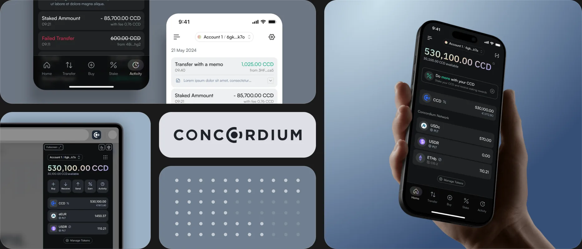
Concordium Wallet
Two crypto wallets on one design system, and the workflow to keep them coherent. A year of work for Concordium across mobile and browser.
01 CONTEXT
Grown without a plan
Concordium is a blockchain company. Their wallets, one on mobile and one as a browser extension, are how people hold tokens and interact with the network. They serve as a showcase for what the chain can do, which left room to redesign them thoroughly.
Concordium brought us in to work alongside their design lead. By then the wallets had passed through enough hands that nothing quite matched anything else.
02 PROBLEM
Years of unconnected decisions
Most screens were fine on their own. None of them knew about each other. Three things had to be true before anything could be redesigned cleanly.
No system, just sediment
Years of decisions had piled up, from internal designers, an external agency, and time. Patterns existed in several flavours, type varied, colour drifted. Underneath sat no foundation, just the residue of reasonable work done without one.
Nothing was where you'd expect it
Figma files were unorganised and components undocumented. Deprecated flows sat next to active ones with no way to tell them apart. Onboarding a designer would have taken weeks just to learn what was where.
Shipping against the chaos
Shipping anything meant first deciphering what existed, then choosing whether to follow a pattern, pick between several, or invent one. Velocity suffered, and so did consistency.
03 WORK
Four passes through the same product
Cleanup, system work, and the product overhaul overlapped, with features shipping while the foundation was being poured. It reads more clearly as four passes than as a timeline.
PASS 01
Mapping what was there
The first weeks were spent untangling every file, flow, and screen to work out what tied to what. Archiving the deprecated, naming what was alive, drawing a map of the product as it actually existed. Less glamorous than a redesign, and more important than one.
PASS 02
Building the system in the background
While features shipped the old way, the design system went in underneath: tokens, components, documentation, conventions, and the branching and versioning workflow alongside. The wallets became the proof of concept for the whole thing. The design system case study goes deeper.
PASS 03
Realigning the wallets to the system
Once the system could take the weight, the wallets got their overhaul. Navigation was rethought, scattered tools pulled into one menu, the unused discover feature removed, account and main menus rebuilt, and type, colour, and spacing aligned across hundreds of screens. Little of it shows in a single screenshot. It shows in the consistency between them.
PASS 04
One language, two platforms
Mobile and the extension do different jobs. Mobile is for daily use. The extension handles transactions tied to a desktop session, like signing into a dApp. They share visual language, components, and primitives, and the layouts diverge where context demands it. Same wallet, two surfaces, coherent without being identical.
04 DECISIONS
Two calls that set the direction
Most decisions on this project were straightforward. These two weren't, and they shaped much of what came after.
CALL 01
Build both in parallel
The safe move was to lock the design system first, then redesign the wallets against it. The faster, riskier move was to build both at once, with the wallets as the live testbed. Features had to keep shipping, and the system had to stay grounded in real product needs.
WHAT WE CHOSE
Both at once. The wallets became the proof of concept for the system, and the system gave the wallets a foundation as it took shape. Tokens, components, and conventions were stress-tested against live product work.
TRADE-OFF
Some early work had to be redone once the system caught up. That was expected. Months of feature work paused to build a system in isolation would have cost more.
CALL 02
Real branching for design files
Most design teams keep one master file, accept the conflicts, and reach for Notion when things get confusing. The alternative was Figma branching with a documented workflow on top, which meant a paid plan upgrade and real time spent on infrastructure.
WHAT WE CHOSE
We pitched it, documented the workflow end to end, got it greenlit, and set it up. Scoped to cover the wallets, the design system, and the ID app, with room for future products to slot in.
TRADE-OFF
The upfront cost was real: the plan upgrade, the documentation, training the team. The payoff is mostly invisible, a workflow that catches breaking changes before they ship and survives the next designer joining. The work was built to outlast any one person on it.
05 OUTCOME
What shipped
Both wallets run on one design system, with consistent navigation, type, colour, and component vocabulary across mobile and the extension. The Figma files are organised, documented, and version-controlled, with a branching workflow that survives designers joining or leaving. The system stretched to cover the ID app.
One lesson carried forward: make the case for the unglamorous parts early. Tooling and process are load-bearing, and the sooner everyone agrees on them, the less the visible work slows down.
- 2
- wallets, one languageMobile and browser extension, sharing a system, type, and components.
- 3
- products on one systemWallets, design system, and ID app, all built on the same foundation.
- 1
- design system, built to lastTokens, components, versioning workflow, and conventions, all written down.
- 1y
- from chaos to shippingFrom mapping the existing files to a redesigned wallet running on a stable foundation.


