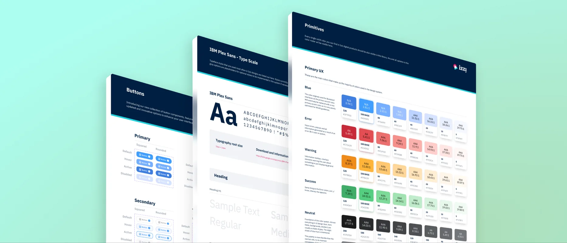
Izzi Design System
One design system, three Izzi products, two very different visual languages.
01 CONTEXT
A suite without a backbone
Izzi is the digital learning suite from Profil Klett, one of the largest educational publishers in the region. Three products sit under it: Bookshelf for grades 5 and up, Playground for grades 1 through 4, and Authoring, where editorial teams produce the content behind both.
Izzi brought us in to lead product design across the suite. Three products were growing in parallel with no shared design language and no shared library, and the brief was to connect them. Over two and a half years we built the system that did.
02 PROBLEM
No gaps to build in
Design systems get built in the gaps between product work. Izzi didn't have those gaps anymore. Three products were shipping in parallel, and three realities made waiting untenable.
Files outpacing their owners
Multi-year accumulation across rotating designers and external agencies. Styleguides got started and abandoned, components duplicated faster than anyone could deduplicate. No one could explain the whole picture anymore, and the documentation described a version of the product that no longer shipped.
Components that didn't flex
Most components had no auto-layout, no properties, no responsive behaviour. Breakpoints varied across modules, and layouts broke the moment a screen size changed. A button needed a new variant for every state, size, and product. Every change was a project.
Two products drifting apart
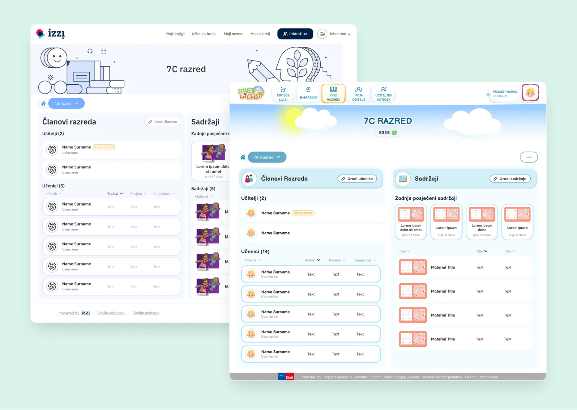
Bookshelf and Playground served similar functions for different age groups, and their visual languages had drifted in opposite directions, one clean and minimal, the other hand-illustrated and interactive. The contrast was a strength. With no shared spine underneath, every component was being built twice.
03 WORK
A system that bent without breaking
The work moved through four stages, in order: audit, foundation, components, divergence. The audit named what existed, the foundation gave the system structure, each product's components got rebuilt to flex on top, and the divergence let Bookshelf and Playground stay themselves without forking the foundation.
STAGE 01
Auditing the entire suite
The first stretch was an audit: every product file, every abandoned styleguide, every component that called itself a master. Buttons defined four ways. Search bars defined three. Three ramps for the same brand colour, all named Primary. The audit produced one document describing the suite's whole surface area, including everything that had to go.
STAGE 02
One foundation, three product libraries
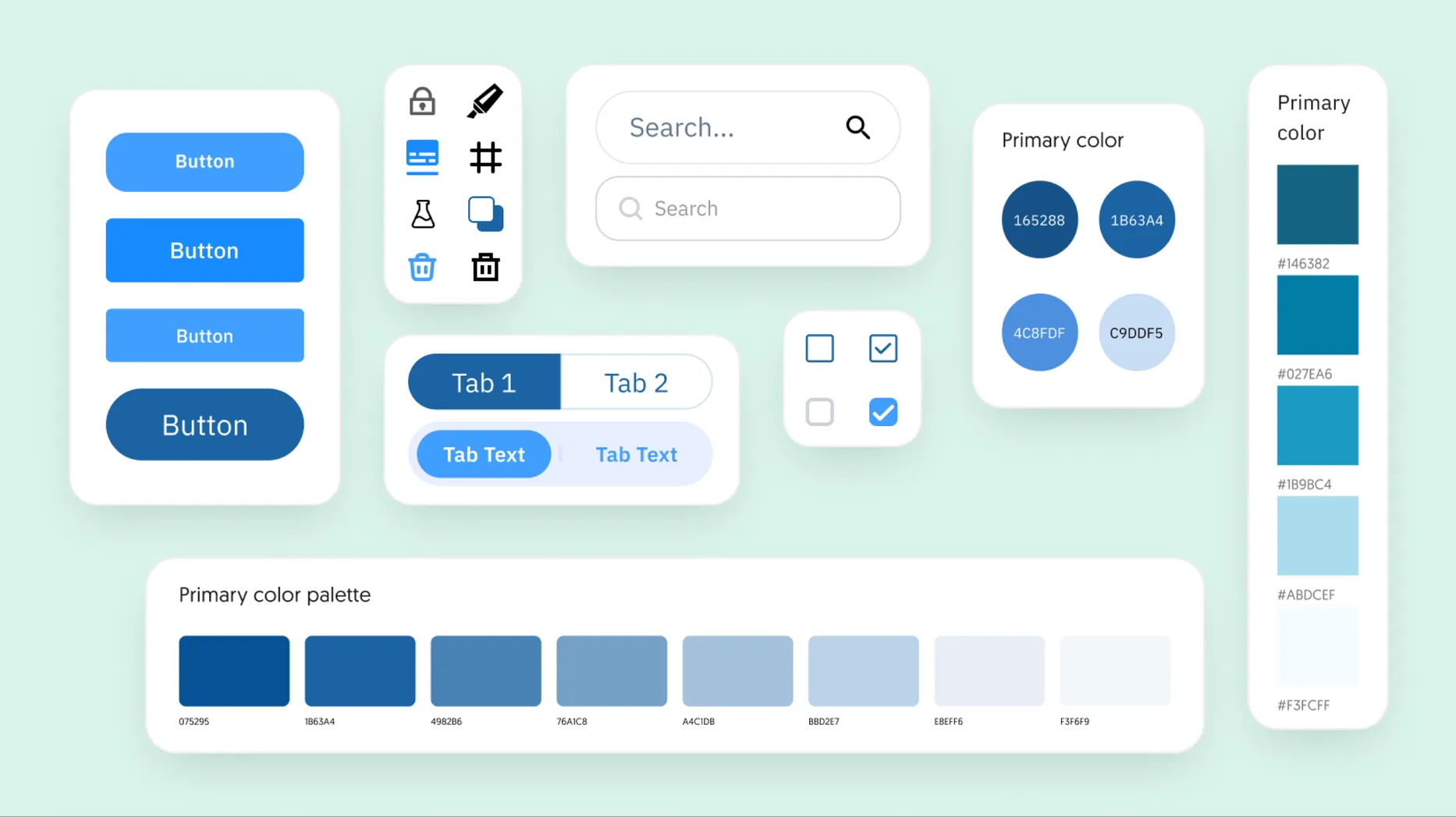
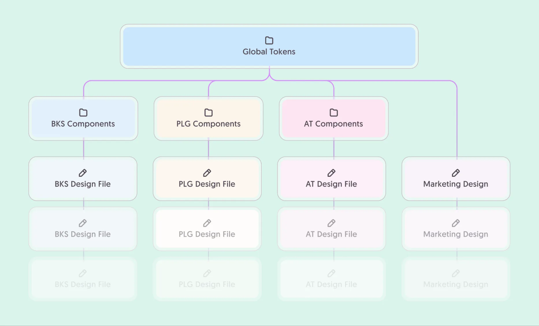
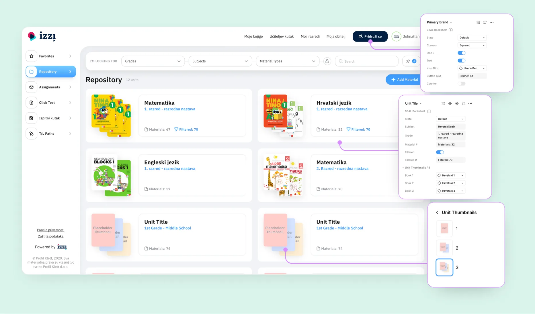
Three weeks pouring global tokens into a single file: colour, type, spacing, effects, motion. From that source, three product libraries branch off, each inheriting the same primitives and layering its own patterns on top. A token change at the root propagates to all three. LEGO sets with shared studs, built for different things.
STAGE 03
Components built to flex
Once the chaos was named, the components got rebuilt. Each product's library got its own set, built with the same techniques: auto-layout, constraints, slots, instance swap, and property models deep enough that one base component could absorb every state, size, theme, and role its product needed. Without that depth, the system would have been a styleguide with a token sheet.
STAGE 04
One foundation, two languages
Bookshelf serves grades 5 and up, Playground grades 1 through 4. Same underlying functions, dramatically different surfaces. Each got its own component library, so Bookshelf's primary button and Playground's are different components entirely. What they shared was the foundation: the same colour ramps, type scale, spacing primitives, and the same patterns for how components were structured. The components diverged. The system underneath stayed shared.
04 DECISIONS
The two contested calls
Most of the design work was technical. These two calls were about priorities and risk.
CALL 01
Pour the foundation first
The visible-progress route was building one product library first: pick Bookshelf, ship a quick win, let stakeholders see the system arriving. The slower route was three weeks on global tokens before any library got built.
WHAT WE CHOSE
Tokens first. Three weeks with nothing demo-able at the end. Every library that followed inherited the same primitives, so a single token change rippled across the suite. Building the first library on hand-tuned values would have cost more to untangle later.
TRADE-OFF
Three weeks looking unproductive from outside the design team, with no product output to show. Worth defending: every week saved later on a colour rename or scale tweak paid that loan back many times over.
CALL 02
Let the surfaces diverge
The natural temptation with a design system is to homogenize, picking one direction and lining the products up behind it. The harder route was letting each product stay itself and forcing the consistency underneath, where the user couldn't see it.
WHAT WE CHOSE
Diverge on the surface, share the foundation. Same tokens, same patterns for building components, while each product's actual components stayed its own. That separation is what let each product keep its character.
TRADE-OFF
Harder to defend at first glance, because stakeholders looking for visible coherence don't see it. The system's point is token reuse across products, component reuse within each, and predictable maintenance everywhere, all of it underneath the skin regardless of how different the skin looks.
05 OUTCOME
What shipped
All three Izzi products run on the same design system. Each keeps its own component library, built on the same patterns and pulling from the same primitives. Designers and engineers reach for tokens by the same names across the whole suite.
One lesson carried forward: make the invisible work legible early. Three weeks of tokens with nothing to demo, and coherence deliberately hidden underneath the surface, both read as slow from outside. Showing the payoff sooner would have spent less goodwill along the way.
- 3
- products on one systemBookshelf, Playground, and Authoring, each with its own component library, all sharing a global token foundation.
- 30%
- faster delivery, on averageOnce the libraries were in use, design-to-handoff time dropped by roughly a third on comparable feature work.
- 1
- shared foundationOne token source of colour, type, spacing, and motion feeding three separate product libraries.
- 2.5y
- from audit to shippedFrom the first file audit to the system running across all three products.


